Overview
MeasurePM's clinical graphing module enables you to effortlessly and effectively generate graphs and charts representing your clients’ programming, behavior, and ABC data. With a range of graphing and chart options to choose from, you can ensure optimal analysis of your clients' data. Below is an example screenshot of the new graphing module.
Accessing the Graphing Module
The new graphing module is accessible through three avenues: (i) List Clients, (ii) Client Clinical Profiles list, and (iii) directly from the client's clinical profile. It is important to note that access to these features is permission-based. This indicates that only individuals who have been granted the necessary permission, as shown below, will be able to view the client graphs.

If you do have the required permission, you will be able to access the new graphing module by following these steps:
Access through List Clients:
- Select Clients from the left-hand navigation menu.
- From the Clients drop down menu select List Clients.
- From there, either scroll to the client’s name you are searching for or use the filtering options to locate the client.
- Once you have found the client of intertest select their name to be taken to the Client Dashboard.
- Scroll down to the last widget on the client dashboard (Client Clinical Profiles) and select the graphing icon as highlighted in the image below.

Access through Client Clinical Profiles:
- Select Clinical Settings from the left-hand navigation bar.
- From the Clinical Settings drop down menu, select Client Profiles.
- From there, either scroll to the client’s name you are searching for or use the filtering options to locate the client.
- Once you have found the client of interest, select the graphing icon under the action tab as seen below.

Access directly from the client's clinical profile:
- Once viewing a client's clinical profile, select the updated graphing icon located to the right of the client's name.

Accessing Graphs for Multiple Profiles
Once you enter the graphing page, the profile through which you entered will be displayed at the top of the page. Beside the name, there is a pencil icon, which will take you back to the profile, or a x icon which will remove the clinical profile from the filter. When selected, a dropdown menu will open, displaying all active profiles for the client. If you would like the list of options to include active and inactive, simply sleect the "Show Inactive" checkbox and the available options will update.
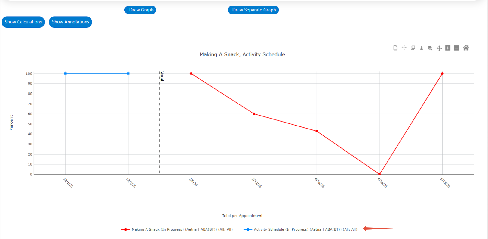
From here, you may select as many profiles as you would like. Note that the list of available programs/behaviors will dynamically update based on the chosen profiles. This means, you will be able to view data across multiple profiles at once. Please note this option is only available for Program/Behavior Graphs.

Graphing Tabs
In the graphing page, there are three separate tabs: Program/Behavior Graphs, ABC Data, and Cumulative. Each tab has different functionalities and operates independently. The Program/Behavior Graphs tab allows you to populate data related to committed programs and behaviors. With the provided tools you can generate customized graphs, enabling you to monitor and analyze client progress over time. The ABC Data tab is designed to populate ABC Conditional Probabilities Charts/Graphs. By analyzing this data, you can identify patterns and relationships between antecedents, behaviors, consequences, and other configured ABC properties. The Cumulative tab allows you to populate cumulative graphs of program statuses, target statuses, and behavior statuses giving you the ability to see progression of programs, behaviors, and targets across time and analyze the rate of learning.
Each is described in more detail in the following sections.

Program/Behavior Graphs
Generating the Graph
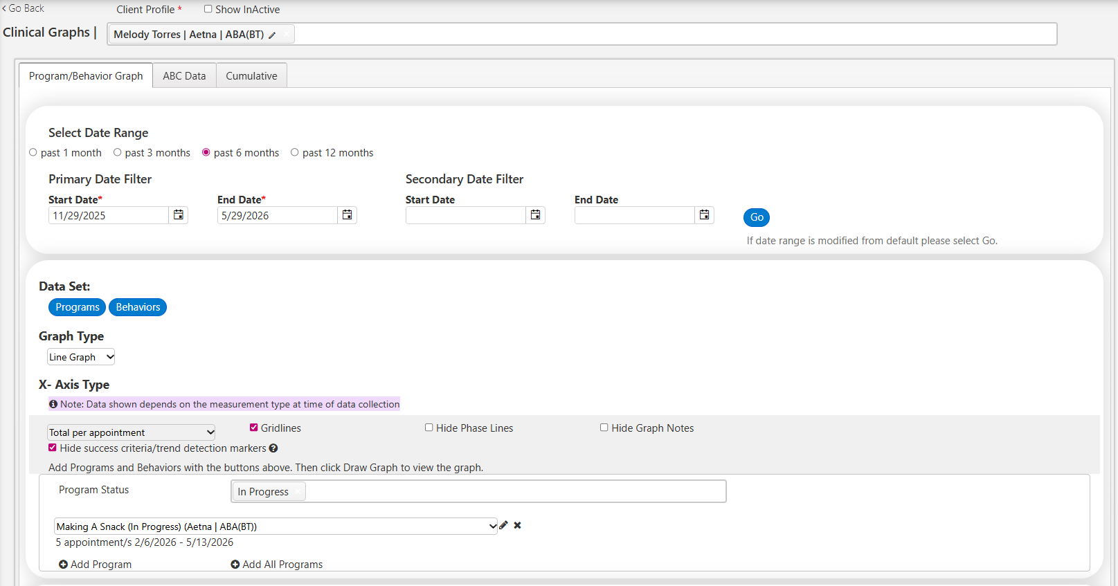
To populate a Program/Behavior graph, select the Program/Behavior Graph tab and follow the steps listed below:
- Determine the specific date range of the data you want to view. You can accomplish this in two ways:
- Radio Buttons: Make use of the radio buttons located at the top of the page. These buttons provide predefined date range options to select from.
- Manual Entry: You can manually enter one or two separate date ranges. If you choose to make selections both for primary and secondary date ranges, two adjacent graphs will be generated. The first graph will display data from the primary range, while the second graph will show data from the secondary range. It is important to note that the primary date range must come before the secondary range, and overlapping of date ranges is not allowed.
By default, the system preselects a date range of one month. If you do modify the start and end dates using either of the above options, ensure that you select the "Go" button before proceeding to the next steps.
- Radio Buttons: Make use of the radio buttons located at the top of the page. These buttons provide predefined date range options to select from.
- Select a data set to graph (Programs or Behaviors, or both).

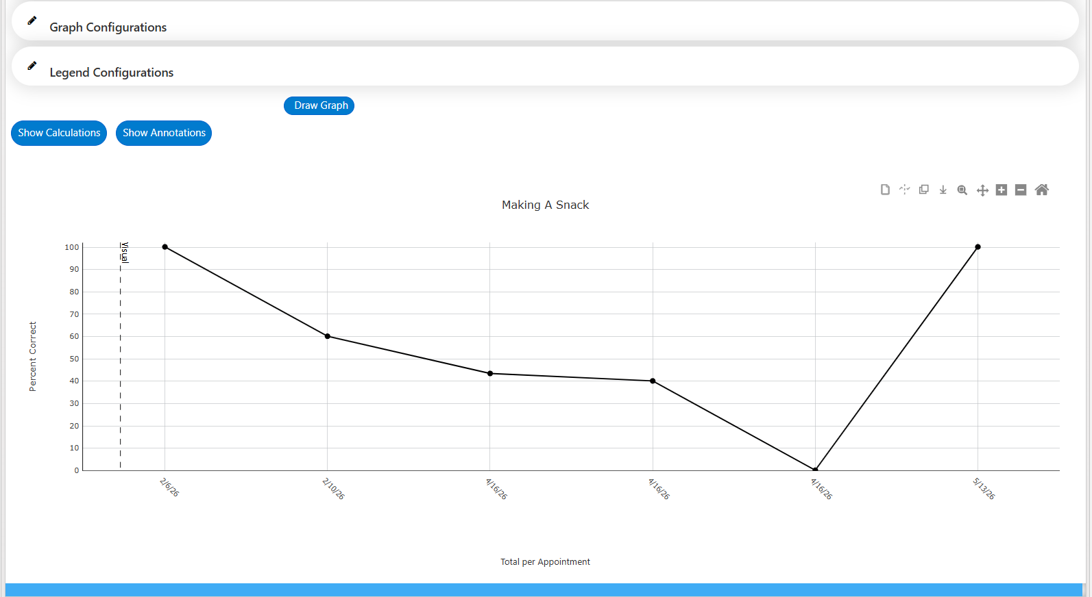
- Once selected, make a graph type selection. The available options include Line Graph, Bar Graph, and Scatter Plot. However, Line Graph will be selected by default.

- Select an x-axis type: You can choose between average per day/week/month, total per appointment/day, or per committed program/behavior episode. Total per appointment will be selected by default.

- "Per Committed Program" will display one data point for each instance the program was committed. For example, if the user records and commits data twice for a program within the same appointment, there will be two data points displayed in the corresponding program graph.
- “Per Behavior Episode” is applicable to frequency and duration-based behaviors. The Mobile-App calculates a committed episode by a 3 second pause in the recording of data. Therefore, if you record 1 occurrence of behavior, and then 5 minutes later record a second occurrence of behavior, there will be two data points displayed in the corresponding behavior’s graph.
- Select a Program/Behavior Status: Default status selections for programs and behaviors are In-Progress. To add additional statuses simply select inside the status box and choose the additional statuses from the drop-down menu. Note, the statuses available here are dependent upon the program and behavior status selections made in Clinical Settings. For more information, please refer to the following guides: (i) Program Statuses (Web and Mobile-App), and (ii) Behavior Statuses (Web and Mobile-App).

- Select + Add Program or + Add Behavior (depending on which data set(s) you chose to populate). See the image below for an outline of steps 1-6.

- When you select "+ Add Program" the program that appears first in alphabetical order will be set as the default option.
- To choose a different program, use the drop-down menu located in the Program name section.
- Beside each program name the profile for which the program belongs will be shown.
- If you want to access filter selections, advanced configurations, and line options, click on the pencil icon located next to the program name.
- If you wish to remove a program from the graph, simply click on the X icon.
- To add another program to the graph, select the "+ Add Program" button. If selected, the next program in alphabetical order will be displayed.
- To add all programs to graph at once, select the "+ Add All Programs" button.

- The steps required to select a behavior following the selection of +Add Behavior are identical to those listed above.
- To choose a different program, use the drop-down menu located in the Program name section.
- Once you select the pencil icon, you can customize filter selections. The measurement type filter will automatically default to the program's measurement type. For example, if the program is based on duration data, the measurement type filter will be set to graph duration data. The other filters such as targets, providers, locations, etc. will initially be set to "All," encompassing all available options. However, you have the flexibility to make specific selections based on your requirements (e.g., generating a graph for a single programming target).
Each time you make a selection, an additional data set will be added to the graph, reflecting the chosen filters. If you prefer to generate the default graph without making any filter changes, you can proceed without modifying the selected filter options. All the available filters are displayed below for your reference.
- Advanced options: Utilize the advanced options to customize your selections and modify the appearance of data sets on the graph. You can configure custom labels (i.e., how the name should be shown in the legend) and define specific line and maker styles for each data series. In the screenshot below, two separate locations (i.e., Home and Office) have been chosen. These selections will be displayed as distinct data paths on the graph. By accessing the advanced options, you can specify how each of these data sets should be visually represented on the graph.

- For each data series, you can also configure line options including trend line, level line, and criteria line by selecting the corresponding checkbox beside the data set. Once a checkbox is selected, you can add custom names for the line (i.e., how the name should be shown in the legend) and configure the line color and type.
- Trend: A line drawn across all data points indicating the trend of the data (will only be available if there is more than one data point on the graph).
- Level: A horizontal line drawn across all data points indicating the average of the data (will only be available if there is more than one data point on the graph).
- Criteria: A horizontal line drawn across all data points indicating the primary success criteria level that has been configured from the program configuration screen.

- Graph Title: To view and modify the graph title, select the pencil icon next to Graph Configurations. Within the Graph Title textbox, you have the option to enter a custom title for the graph. Alternatively, if you wish to exclude a graph title simply check the Hide Graph Title checkbox.

- Axis intervals: To adjust the intervals for the x-axis and the primary and secondary y-axes of the graph, select the pencil icon next to Graph Configurations. It is possible to include multiple y-axes on the graph, such as when graphing multiple variables like percentage correct, frequency, and duration at once. However, it is important to note that only the first two y-axes can be customized. Customizing the axes is an optional step, and if no changes are made the graph will use the default axis intervals.
- X-axis options:
- Hide dates with no data drop down: You can opt to view all dates within your selected date range on the x-axis or only dates that have data associated with it.
- Label: You can set the title of the axis.
- Interval: You can set the interval in which dates appear on the x-axis.
- Tick marks: You can opt for none (default) or major tick marks to appear on the axis.
- Y-axis options:
- Label: You can set the title of the axis.
- Min: You can adjust the minimum value along the y-axis
- Max: You can adjust the maximum value along the y-axis.
- Interval: You can set the intervals along they-axis.
- Major Tick Marks: You can opt for none (default) or major tick marks to appear on the axis.
- Minor Tick Marks: You can opt for none (default) or if you have chosen to include major tick marks you may also opt to have minor tick marks appear on the axis.

- X-axis options:
- Legend configurations:
- Legend placement drop down: You can modify the placement of the legend on the graph by using the dropdown menu to select one of the following options, bottom (default), right, left, or above.
- Legend outline checkbox: Determine whether you want a solid black outline around the legend. To enable this feature, select the Legend Outline checkbox.
- Legend title: By default, the legend title is set as "Legend." However, you can customize it by entering your desired title into the associated textbox.
- Hide Legend checkbox: If selected, the legend will be hidden from the graph and if unselected the legend will be displayed.

If you have added multiple data sets (e.g., multiple programs/behaviors) onto your graph, a legend will populate by default with the above configurations. Once the legend has populated, it becomes interactive on the graph. If the name of a data set is selected in the legend, the text within the legend will be displayed in light grey and the corresponding data set will be temporarily hidden from the graph. Simply select the data set name in the legend for it to again be displayed in the graph. Note that you do not need to select Draw Graph for these changes to occur.
- Gridlines: By default, gridlines will be displayed across the entire area of the graph. However, you have the option to hide gridlines by unselecting the Gridlines checkbox beside the x-axis type.
- Hide Phase Lines: By default, all phase lines will be shown on the graph. However, if you would like to hide the phase lines, you can select the Hide Phase Lines checkbox beside the x-axis type.

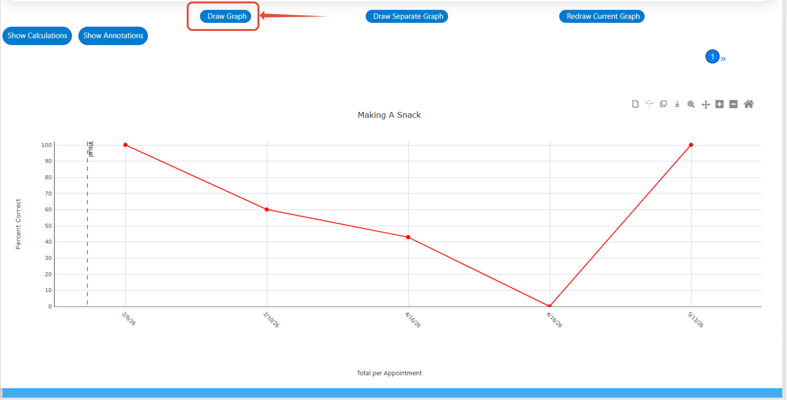
- Draw graph: After completing all the desired customizations, select the Draw Graph button to generate the graph with the specified settings. If any modifications are made to configurations (e.g., renaming the legend, adjusting the axes, adding additional targets to the graph, etc.) following the initial graph generation, the Draw Graph button must again be selected for those changes to take effect and be reflected in the updated graph.
Options on Graph Itself
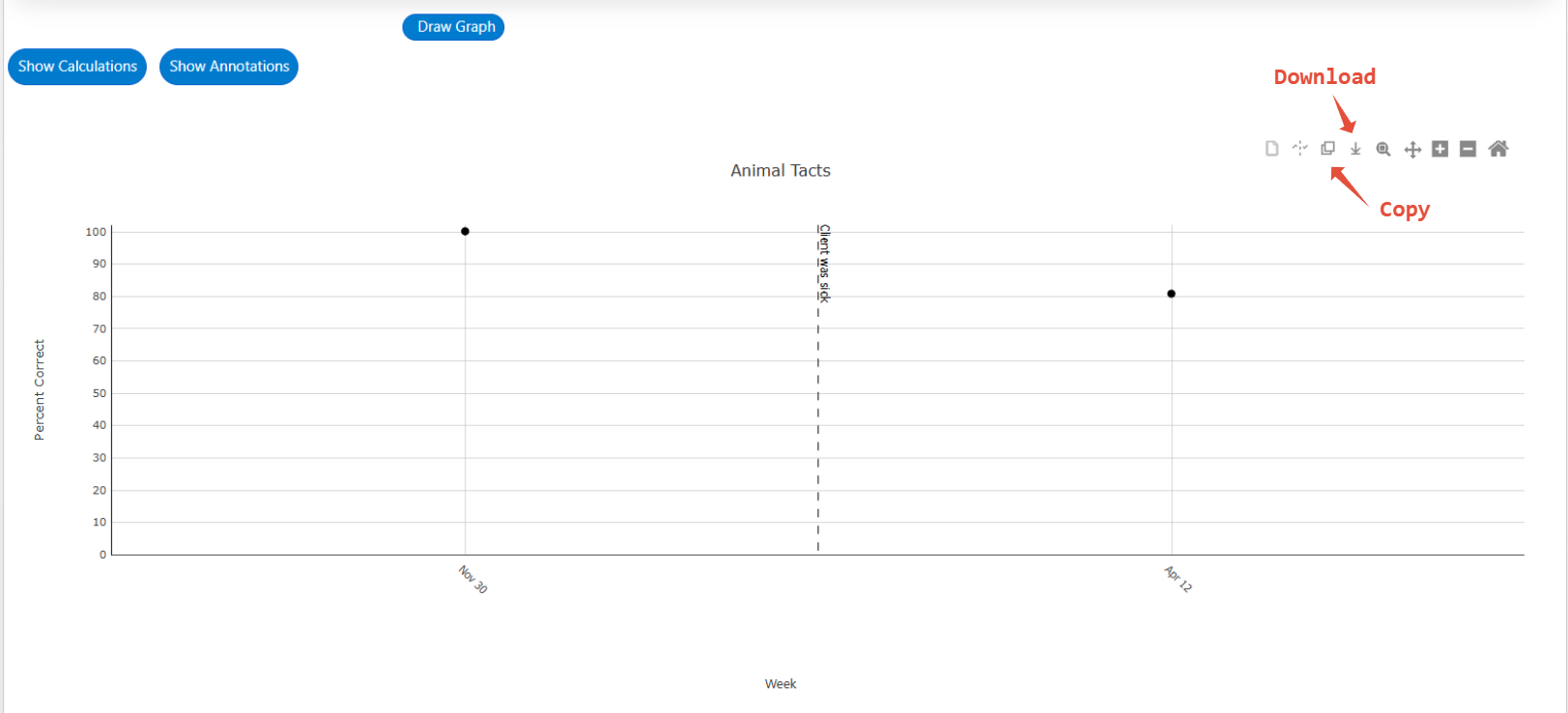
Located in the top right-hand corner of the generated graph is a toolbar containing various icons, which allow you to add annotations (a.k.a graphing notes), phase lines, copy the graph as an image, download the graph as an image, zoom in/out, pan the graph, and reset the axes.
Graphing Notes:
- Add:
- On Program and Behavior graphs you are now able to add notes to specific appointments. This is done via the Add Note to Graph button in the graph tool bar. The icon will only be available if graphing across the following axis types:
- Per committed program/behavior
- Total per appointment
- Total per day
- Average per day
- On Program and Behavior graphs you are now able to add notes to specific appointments. This is done via the Add Note to Graph button in the graph tool bar. The icon will only be available if graphing across the following axis types:
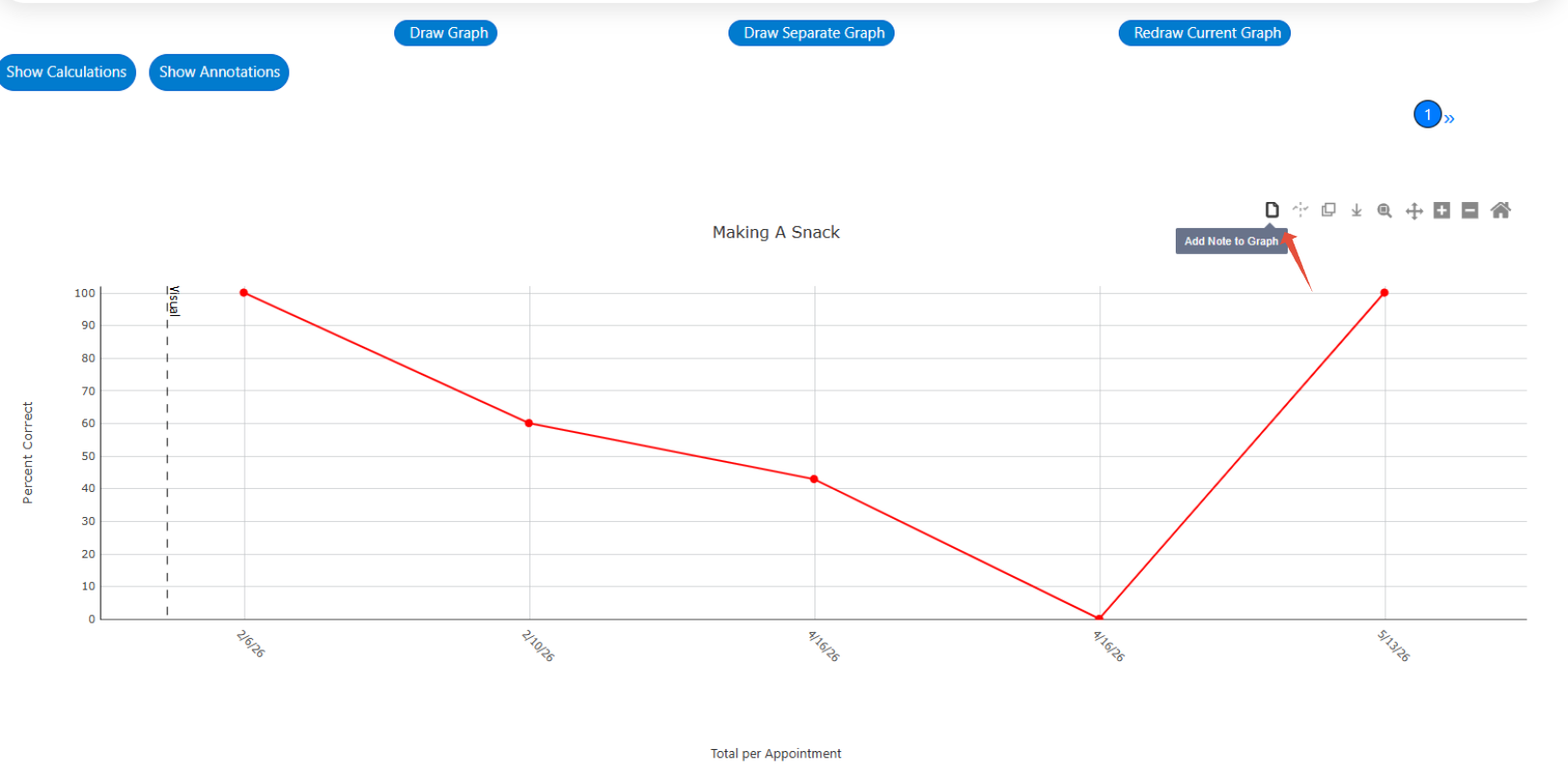
Once the icon is selected you will be prompted to select a note type and an appointment to associate the note to.

Step 1: Select appointment note type. From here you can chose between:
- Current Program/Behavior: The added note will only appear on the programs/behavior graphs that are actively showing on the graph
- Across all Programs and Behaviors: The added note will be displayed across all mapped programs and behaviors
- Across all Programs: The added note will be displayed across all mapped programs
- Across all Behaviors: The added note will be displayed across all mapped behaviors

Step 2: Select an appointment you would like the note to be associated with.
Step 3: Enter text into the notes text box
 Step 4: Save or Cancel
- Save = Note will be saved and added to the graph(s)
- Cancel = Note pop up will be closed and note will not be added

Once saved, the note will appear above the appointment date on the graph(s) as a small up arrow (i.e., caret). If there is more than one note on the same appointment it will appear as a double caret above the date.
To preview the note, hover your cursor on the note icon and select the icon to delete/edit.

Once the note is opened, select the pencil icon to unlock editing. Once editing is unlocked you can make changes as needed, select the trashcan icon to delete the note and/or select the small x to discard the changes. Once changes have been made, select Save. Alternatively, to close the pop up without saving your changes select the X in the top right hand corner of the pop up or select Cancel. Please note, graphing notes can be reviewed across all axis types, however, notes cannot be edited/deleted when viewing a per week or per month graph.

Web Graphs- Hide Graphing Notes
Within graph configurations there is also an option to "Hide Graph Notes". When unselected (the default choice), any notes that have been added to your graph will show and be presented as "^" above the appointment date the note was added to. If this checkbox is selected, the graph note icon will be temporarily hidden from the generated graph.

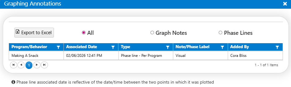
Web Graphs- Show Annotations
There is a new button on web graphs titled "Show Annotations".
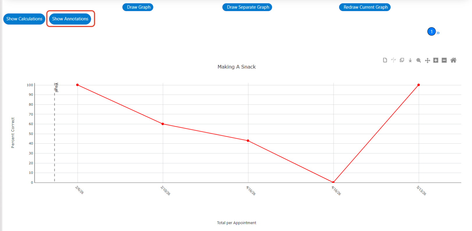
When selected, a pop up will appear with a history of all phase lines and graphing notes that have been added to the graph within the specified date range. This will include the program/behavior name, associated date, type, label, and the name of the user who added the annotation. The displayed table can be exported to Excel, and sorted by type if desired.
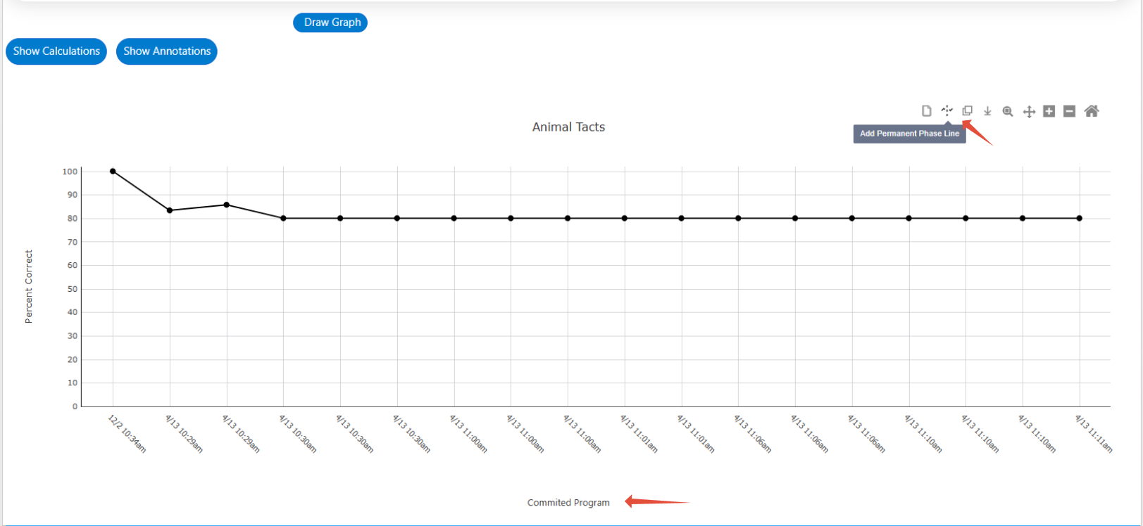
Phase Lines
- Add:
- Permanent phase lines can be added to per committed, total per appointment, total per day and average per day graphs. Permanent phase lines get stored in the database, sync with the Mobile-App, and will be reflected when logging back into the Web and Mobile-App.
- Temporary phase lines can be added to average per week and average per month graphs. Temporary phase lines do not get stored in the database and will not be displayed when the graph is redrawn.
When hovering over the add phase line button, text will be displayed indicating whether you are adding a phase line on a permanent or temporary basis.
Permanent example:
Temporary example:

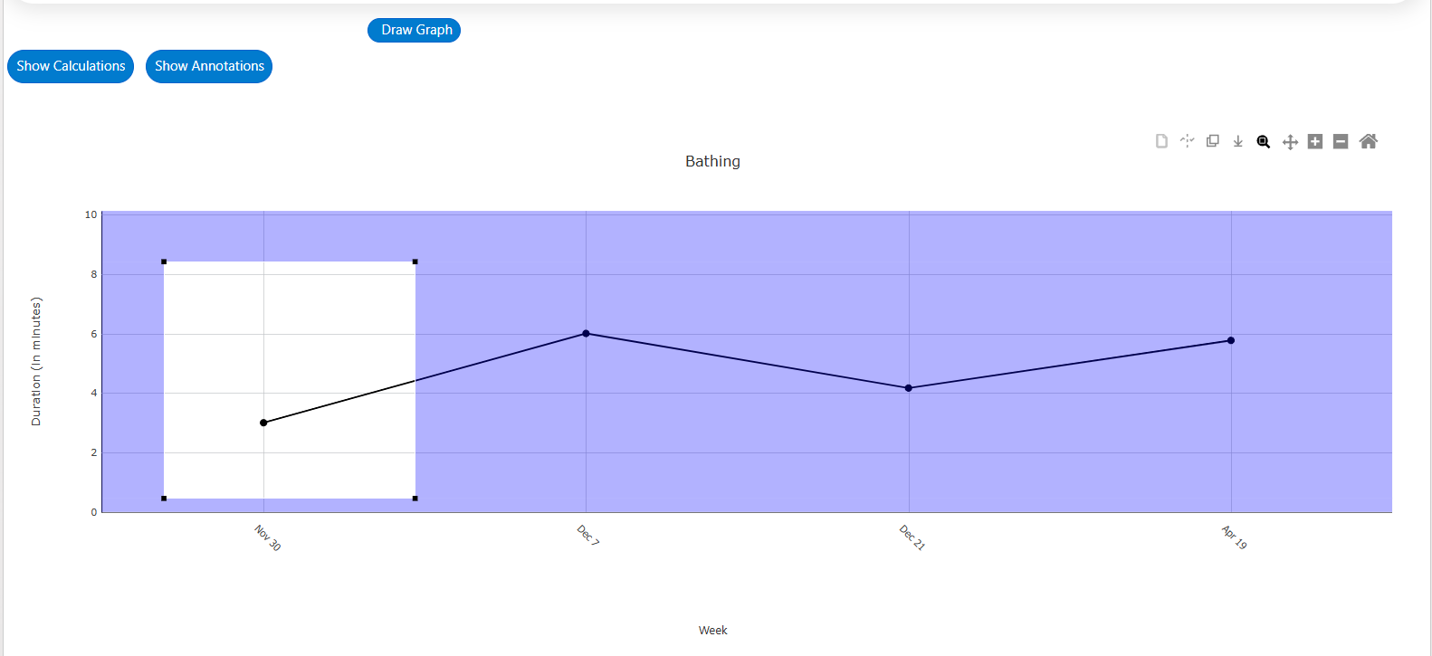
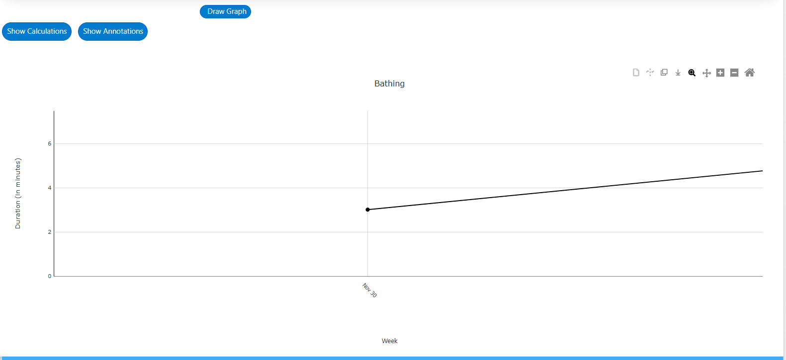
After selecting the add phase line button, you can plot the phase line by dragging and dropping your cursor to your intended location on the graph. Note, phase lines can only be added between data points and not directly over a data point. Refer to the image below to see phase line placement.
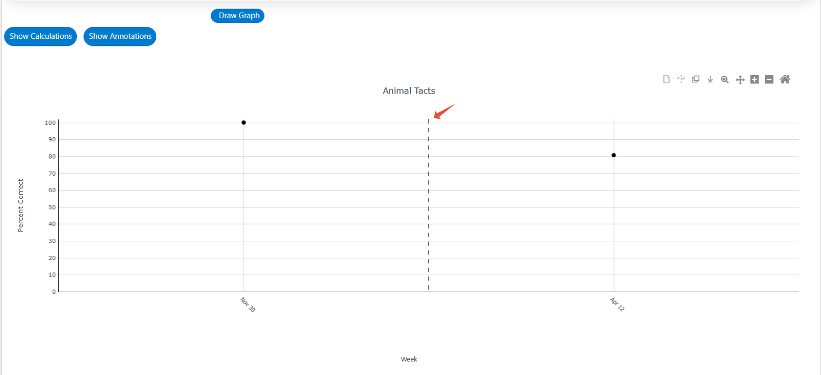
After placing the phase line on the graph, you have the option to label it by entering text into the Name text box. Alternatively, you can copy text from the phase objective or prompt level if configured, by selecting either button. Once added to the graph, this text will be displayed directly onto the phase line.
Additionally, you can customize the line configurations for the phase line using the following options:
- Cut/Uncut: By selecting "Cut," the data path will be interrupted by the phase line. Choosing "Uncut" will allow the data path line to continue uninterrupted over the phase line.
- Line type: You can choose between three options for the line type: dashed (default), dotted, or full (i.e., solid line).
- Color: Select the desired color for the phase line.
Once you have configured the phase line according to your preferences, select the Add Phase Line button. This action will return you to the graph view with the newly added phase line displayed. 
- If you are adding a permanent phase line on a Total per Day or Average per Day Graph, Type will also be an available configuration. Type allows you to add "global phase lines", which means applying a phase line to all program graphs, all behavior graphs, or both. Specifically the options include:
- Current Graph: This option will add the phase line to the graph you are currently viewing only
- Current Graph and All Program Graphs: This option will add the phase line to the graph you are currently viewing ad also to all other program graphs
- Current Graph and All Behavior Graphs: This option will add the phase line to the graph you are currently viewing ad also to all other behavior graphs
- All Program and Behavior Graphs: This option will add the phase line to all program and behavior graphs including the graph you are currently viewing

- The header associated with the phase line pop-up window and the information text displayed when hovering over the “?”, will indicate the type of phase line being added/edited (i.e., permanent, or temporary). Hovering over the information icon will provide an explanation as to why the line is permanent or temporary.
- Permanent: Available to add to all graph types excluding per week and per month. Note that you are still able to edit and delete permanent phase lines. They are permanent in the sense that when the graph is redrawn, they will continue to be displayed.
- Temporary: Available to add to per week and per month graphs only. Temporary phase lines will be displayed on that generated graph but will be removed once the graph is redrawn.

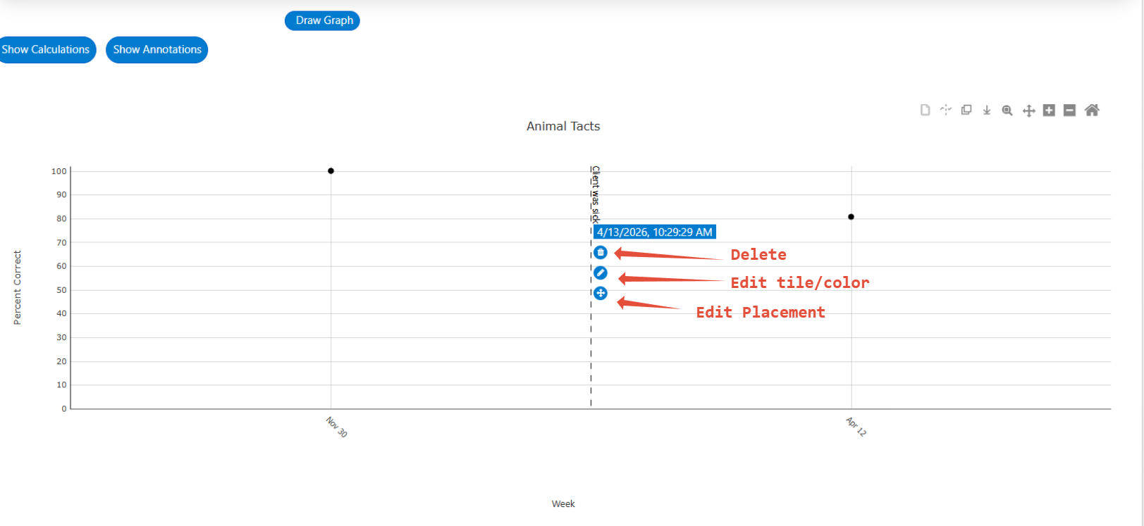
- Edit/Delete: Once the phase line has been added, you will see it on your graph. At any point, you can hover over the phase line to make changes to it.
- Delete: Select the trashcan icon to remove the phase line.
- Edit title/color/line: Select the pencil icon to edit the configurations of the phase line.
- Edit placement: Select the crossed arrow icon to move the phase line to a different location on the graph. Once selected, the phase line will be moveable, and can be dragged and dropped to the intended location on the graph.
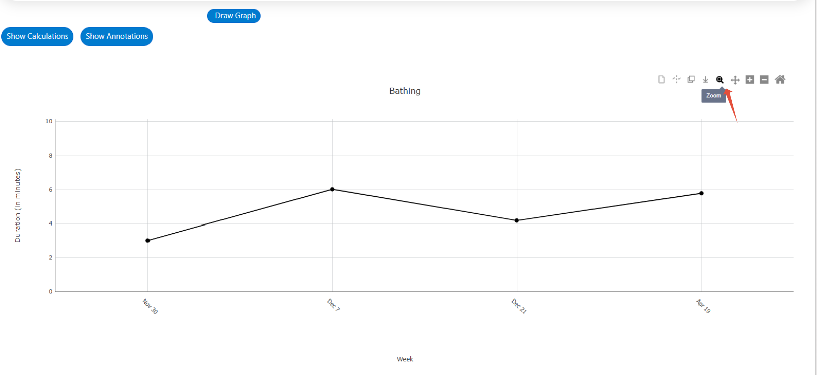
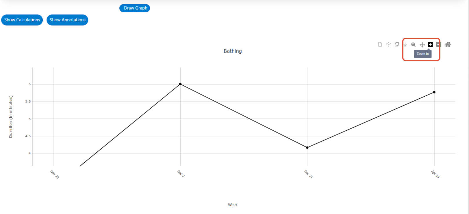
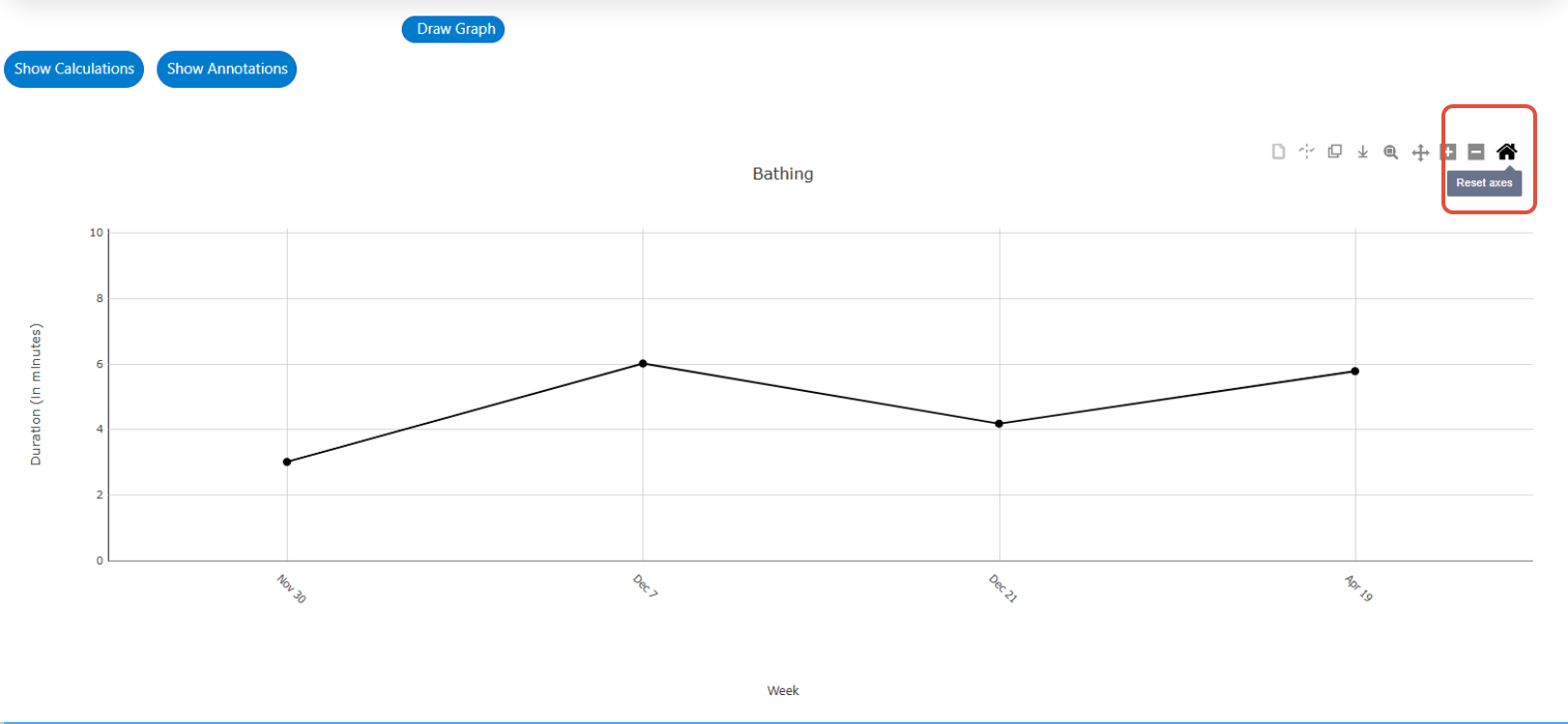
Zoom In/Out: You also have the option to zoom in and out on the graph by selecting either the plus or minus icons.
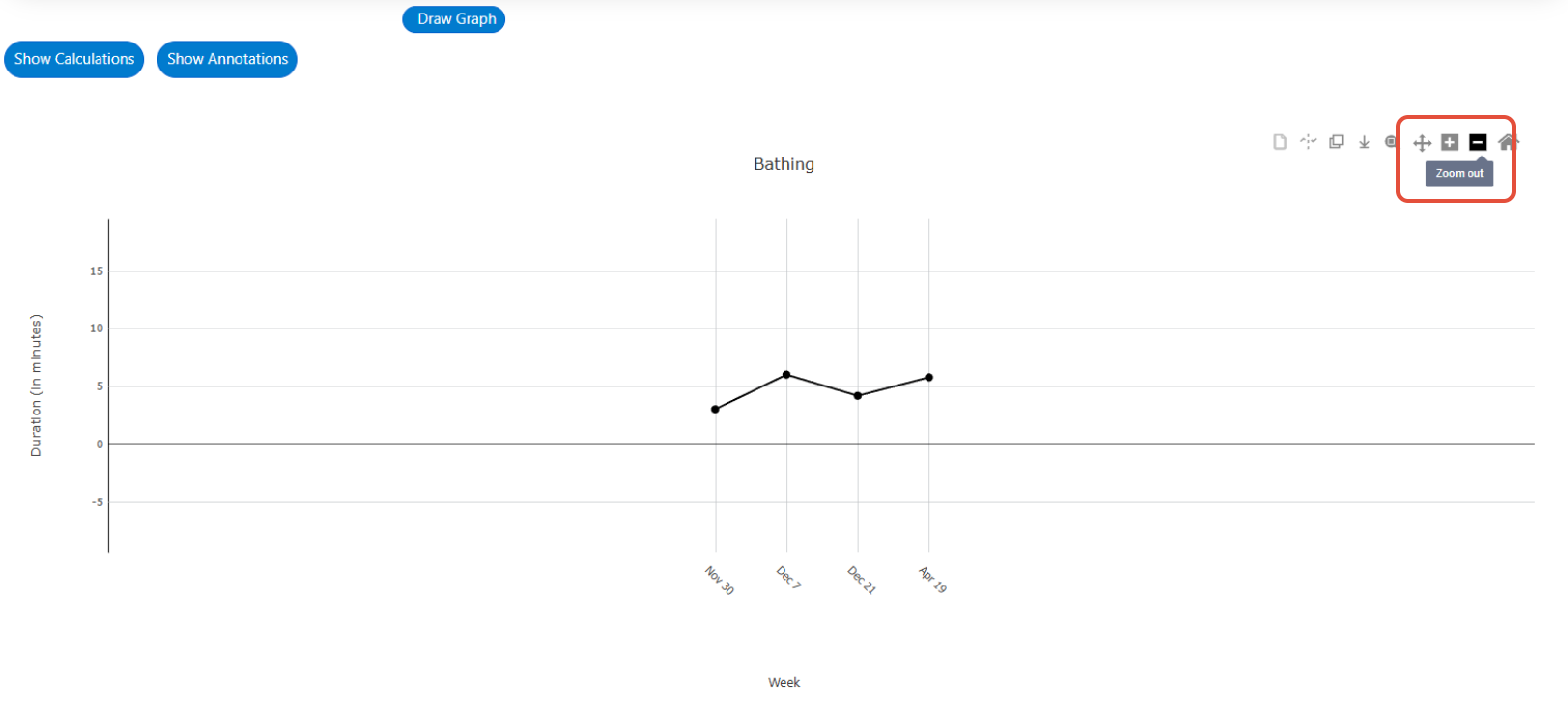
Reset Axes: Selecting the house icon will reset any zoom actions that have been selected restoring the graph to its original state.
To note, this toolbar and all icons will be visible on all graphs including program, behavior, ABC and cumulative.
Decision Points can Show on Graphs:
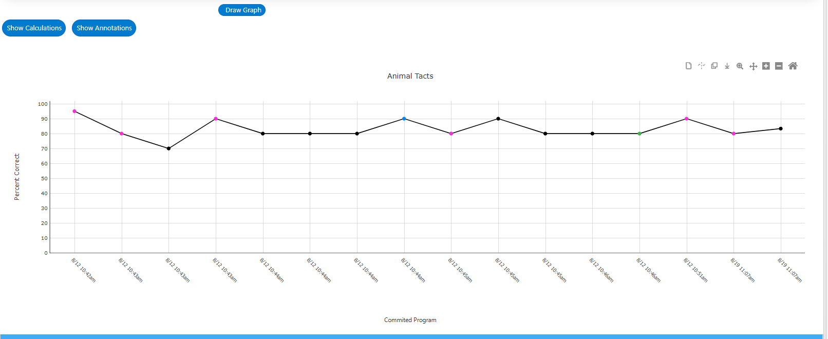
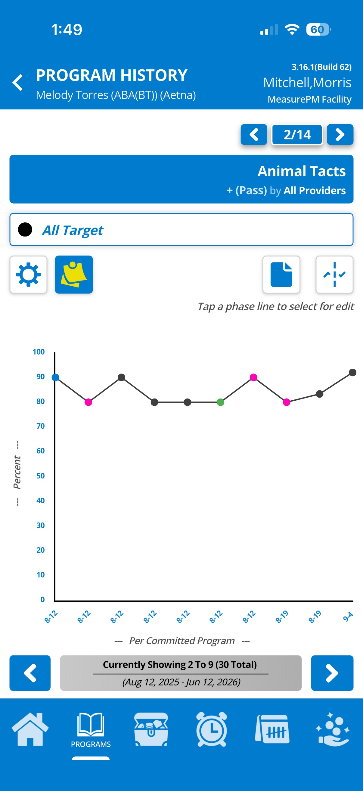
Detection of Success Criteria or a Trend can be visually displayed on Web and Mobile-App graphs if desired. By default the detection markers will be hidden, however if you would like them to show you can simply deselect the "Hide success criteria/trend detection markers" checkbox under the settings.
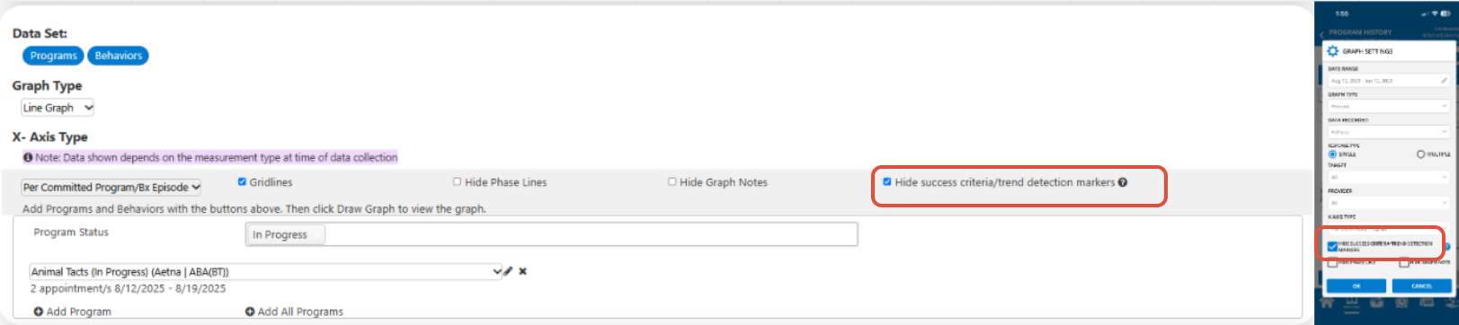
The markers displayed are color coded:
- Green: Success Criteria met
- Pink: Trend was detected
- Blue: Both Success Criteria met and Trend detected simultaneously
Decision Points displayed on the web graph
For more information on success criteria please refer to the following guide: Success Criteria
For more information on trend tracking, please refer to the following guide: Trend Tracking
ABC Data
Generating a Chart or Graphs:
To populate ABC data conditional probability data, select the ABC Data tab from the top of the page and follow the steps listed below:
- Determine the specific date range of the data you want to view. You can accomplish this in two ways:
- Radio Buttons: Make use of the radio buttons located at the top of the page. These buttons provide predefined date range options to select from.
- Manual Entry: You can manually enter a date range via the associated fields.
By default, the system preselects a date range of one month. If you do modify the start and end dates via either of the above options, ensure that you select the "Go" button before proceeding to the next steps.
- From ABC Data Type field, select Conditional Probabilities Chart to generate a chart (i.e., table) or select Conditional Probabilities Graph (i.e., graphical display of the conditional probability data).
- Make Primary and secondary filter selections. Note that you must make a primary filter selection to generate a chart or graph, and secondary filter selections, although not required, only become available after making a primary selection.
- In the drop-down menu, you can indicate the properties you wish to include or exclude from the filter selections by selecting or unselecting the displayed checkboxes. All included properties will be indicated by the blue checkmarks. Please note that all properties are automatically selected by default.

- Specify which behaviors you would like to include in the chart from the Behaviors drop-down menu by selecting or unselecting any of the available options. Please note that all behaviors are automatically selected by default.

- Select Draw Chart to populate the chart or Draw Graph to populate the graphs.
See the image below for an outline of steps 2-6.

Options on Chart
To view chart calculations, select the Show Calculations button found in the top left-hand corner above the generated chart. Along the top right-hand corner there is a toolbar containing various icons that allow you to do any of the following: (i) copy the chart as an image, (ii) download the chart as an image, and (iii) export the chart to excel.

- Show Calculations: Once selected the calculations for the populated chart will be displayed, which are specific to the primary filter selected.

- Export:
- Copy/Download: When you are satisfied with your chart you have the option to copy or download the image. To perform either of these actions, use the two icons located in the graph toolbar.
- Excel: Use the third option to export to the chart to excel. In the image below you can see how the chart appears in Excel once exported.

Options on Graphs
To view graph calculations, select the Show Calculations button found in the top left-hand corner above the first generated graph. Along the top right-hand corner of each graph there is a toolbar containing icons that allow you to copy the graph as an image, download the graph as an image, zoom into a specific area on the graph, zoom in, zoom out and reset axes. Located at the bottom of each generated graph is Advanced Configurations allowing you to modify the display of each graph as needed. Each of these are further explained below.
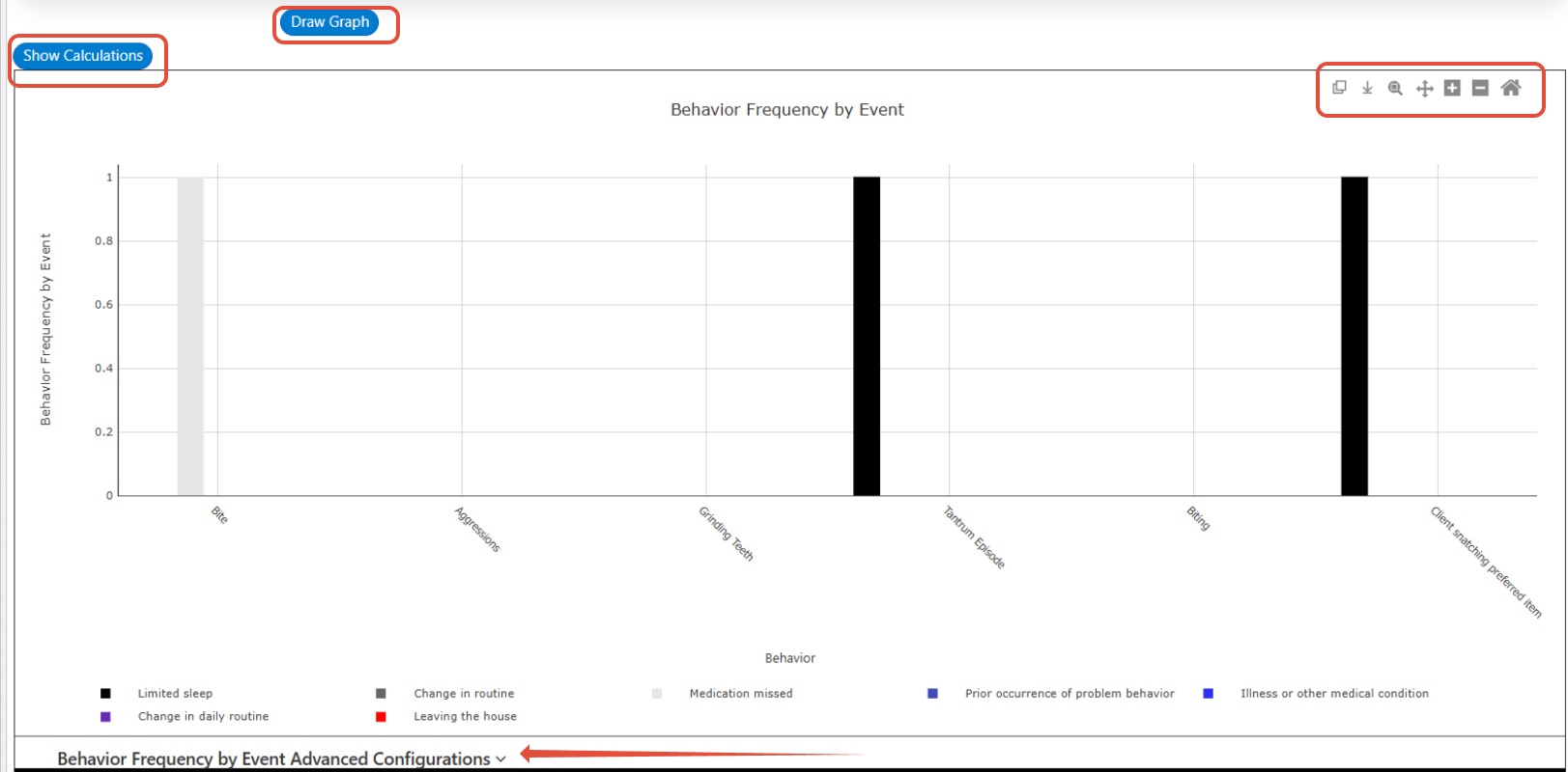
- Show Calculations: Once selected the calculations for the populated graphs will be displayed, which are specific to the primary filter selected.
- Export via Copy/Download: When you are satisfied with your graphs, you have the option to copy or download each graph as an individual image. To copy select the square icon in the graph tool bar and to download select the down arrow icon.
- Advanced Configurations: Select the downward facing arrow beside Advanced Options below each graph. Once opened the following configurations are available:
- Data series: You can add/configure custom titles and specify bar fill and pattern colors for each data series. In the screenshot below, Antecedent has been selected as the primary filter and as such each applicable antecedent (i.e., demand placed, attention withheld, preferred item hidden, and no clear antecedent) is considered a separate data set that can be configured.

- Graph configurations: Within the Graph Title textbox, you have the option to enter a custom title for the graph. Alternatively, if you wish to exclude a graph title simply check the Hide Graph Title checkbox. To hide graph gridlines unselect the Gridlines checkbox.

- Axis configurations:
- X-axis options:
- Label: You can set the title of the axis.
- Tick marks: You can opt for none (default) or major tick marks to appear on the axis.
- Y-axis options:
- Label: You can set the title of the axis.
- Min: You can adjust the minimum value along the y-axis
- Max: You can adjust the maximum value along the y-axis.
- Interval: You can set the intervals along the y-axis.
- Major Tick Marks: You can opt for none (default) or major tick marks to appear on the y-axis.
- Minor Tick Marks: You can opt for none (default) or if you have chosen to include major tick marks you may also opt to have minor tick marks appear on the y-axis.

- X-axis options:
- Legend configurations:
- Legend placement drop down: You can modify the placement of the legend on the graph by using the dropdown menu to select one of the following options: bottom (default), right, left, or above.
- Legend outline checkbox: Determine whether you want a solid black outline around the legend. To enable this feature, select the Legend Outline checkbox.
- Legend title: By default, the legend title does not populate. However, you can customize it by entering your desired title into the associated textbox.
- Hide Legend checkbox: If selected, the legend will be hidden from the graph and if unselected the legend will be displayed. By default, the legend is always shown.

- Data series: You can add/configure custom titles and specify bar fill and pattern colors for each data series. In the screenshot below, Antecedent has been selected as the primary filter and as such each applicable antecedent (i.e., demand placed, attention withheld, preferred item hidden, and no clear antecedent) is considered a separate data set that can be configured.
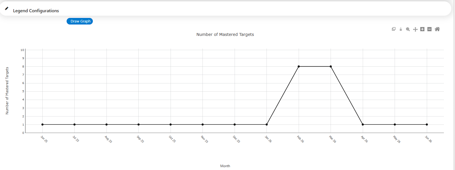
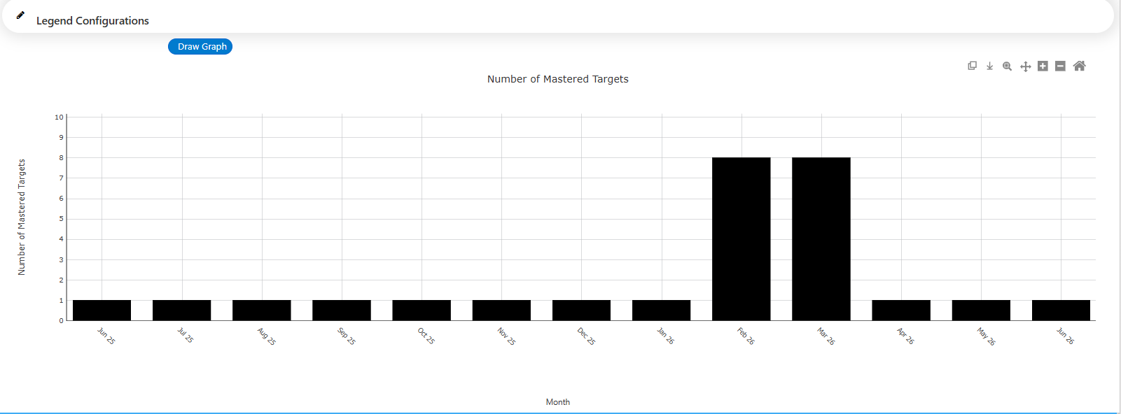
Cumulative Graphs
Generating the Graph
The following image outlines all the required steps. For additional details on how to populate cumulative graphs, please refer the steps listed below the image.

- Select the Cumulative Graph tab and follow the steps listed below:
- Determine the specific date range of the data you want to view. You can accomplish this in two ways:
- Radio Buttons: Make use of the radio buttons located at the top of the page. These buttons provide predefined date range options to select from.
- Manual Entry: You can manually enter one or two separate date ranges. If you choose to make selections both for primary and secondary date ranges, two adjacent graphs will be generated. The first graph will display data from the primary range, while the second graph will show data from the secondary range. It is important to note that the primary date range must come before the secondary range, and overlapping of date ranges are not allowed.
By default, the system preselects a date range of one month. If you do modify the start and end dates using either of the above options, ensure that you select the "Go" button before proceeding to the next steps.
- Make Graph Type and Axis Type selection:
- Graph Type: Choose between line graph and bar graph. Line graph will be selected by default.

- Axis Type: Choose between per day, per week, per month, per quarter and per 6 months. Per day will be selected by default.

- Graph Type: Choose between line graph and bar graph. Line graph will be selected by default.
Make any of the following filter selections:
Select a Program Status: To generate a graph or data set displaying the number of programs across specific statuses, select the statuses of interest from this dropdown menu. Note, the statuses listed here are based on which statuses have been made active in Clinical Settings. For more information on program statuses, please refer to this guide.
Available selections: Program statuses selected:
Select a Program: All Programs will be selected by default, meaning target statuses across all mapped programs will be graphed into one data set. Selecting the Target Status box will display a list of the client's mapped programs, where you can either make a single selection or select multiple programs.
- Select a Target Status:
- Select a target status: By default no status will be selected, however, all target statuses will be available for selection. You must select at least one status to proceed with generating a graph. There is no limit to the number of statuses that can be selected. Each selection will be displayed as an additional data path on the graph. Attempting to populate a graph without making a selection here will result in an error.
Error message: Available selections:
 Target status selected:
- Select a target status: By default no status will be selected, however, all target statuses will be available for selection. You must select at least one status to proceed with generating a graph. There is no limit to the number of statuses that can be selected. Each selection will be displayed as an additional data path on the graph. Attempting to populate a graph without making a selection here will result in an error.
- Select a Behavior Status: To generate a graph or data set displaying the number of behaviors across specific statuses, select the statuses of interest from this dropdown menu. Note, the statuses listed here are based on which statuses have been made active in Clinical Settings. For more information on behavior statuses, please refer to this guide.
Available selections: Behavior status selected:
- Optional configurations:
- Advanced Options: Select the down arrow beside Advanced Options to make changes to data sets, including: (i) changing the label, (ii) modifying marker and line styles, and (iii) adding level and trend lines.
- Graph Configurations: Select the pencil icon beside Graph Configurations to edit the graph title and axis configurations.

- Legend Configurations: Select the pencil icon beside Legend Configurations to modify legend placement, border, and title of the legend. Note that this will only be relevant if you have more than one data set on your graph.

- Advanced Options: Select the down arrow beside Advanced Options to make changes to data sets, including: (i) changing the label, (ii) modifying marker and line styles, and (iii) adding level and trend lines.
4. Draw Graph: After completing all desired customizations, select Draw Graph. If any modifications are made to configurations (e.g., renaming the legend, adjusting the axes, adding additional target statuses to the graph, etc.) following the initial graph generation, the Draw Graph button must again be selected for those changes to take effect and be reflected in the updated graph.
Example shown below of a cumulative line graph
Example shown below of a cumulative bar graph
Reminders
If changes or updates need to be made to the generated program/behavior graph, ABC data chart or graph, or cumulative graph, first make the desired modifications followed by selecting the Draw Graph (Redraw Graph for ABC graphs) or Draw Chart button. All updated configurations will then be displayed in the graph.
For any additional comments or questions, please reach out to support@measurepm.com